Brand / Campaign / Print
Lincoln Calling 2021 Festival Identity & Campaign
A surrealist identity system and multi-phase promotional campaign for the festival's 18th year.
- Client
- Lincoln Calling
- Industry
- Music, art and education nonprofit
- Role
- Illustration and design lead
- Year
- 2021
- Services
- Brand identity, Creative direction, Illustration system, Print collateral, Environmental graphics, Social campaign
The problem
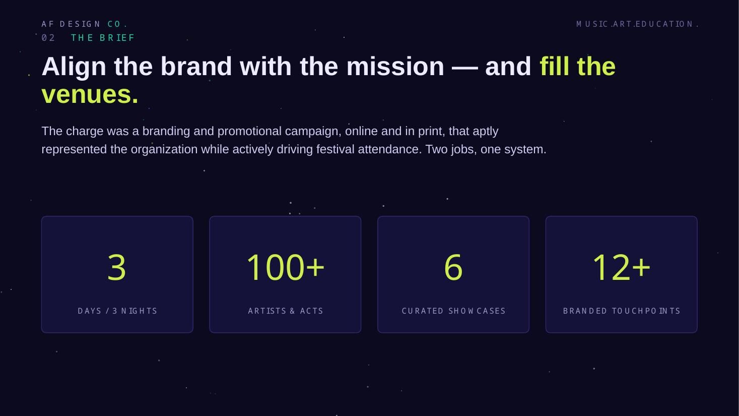
Lincoln Calling had to do two things with one budget: represent a nonprofit arts mission honestly, and sell tickets to a three-day, 100+ artist festival. A lineup flyer would have done neither well.
Background
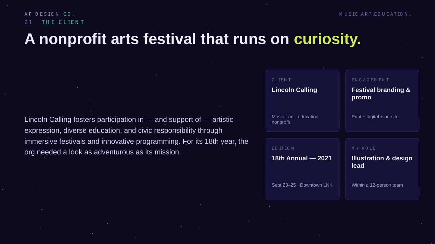
Lincoln Calling is a nonprofit arts festival supporting artistic expression, diverse education and civic responsibility across three days and nights in downtown Lincoln, Nebraska.
For its 18th year the organization needed a brand and promotional campaign — online and in print — that represented the mission accurately while actively driving festival attendance. Two jobs, one system: more than 100 artists, six curated showcases and a dozen-plus branded touchpoints.
Objectives
- 01
Give the festival a brand that reads as art, not advertising
- 02
Drive attendance across print, social, email and on-site channels
- 03
Build a system a small team could extend for a dozen-plus touchpoints
Audience: Festival-goers across the region, plus the artists, sponsors and civic partners the nonprofit depends on.
Process
Planning, strategy, execution.
- 01Planning
Scoping a festival, not a poster
Planning started with the inventory: every touchpoint the festival would need between announcement and load-out, and who would produce each one.
- Mapped touchpoints end to end — posters, guide, wayfinding, credentials, merch, social, email
- Set the production calendar against the announcement, on-sale and event dates
- Agreed the constraint up front: one illustration library, reused everywhere, no one-off art
- 02Strategy
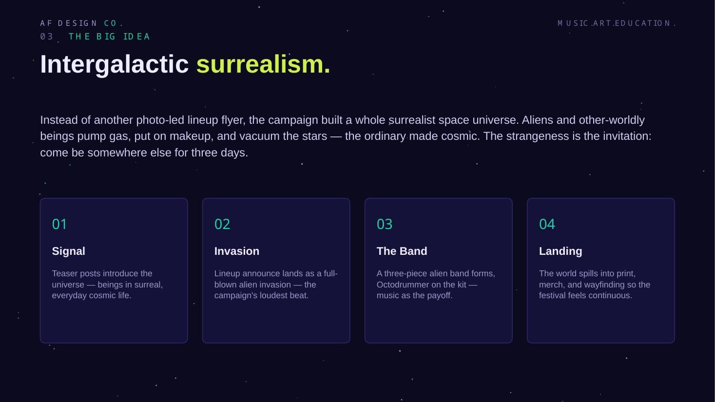
Intergalactic surrealism as the platform
One bold concept — intergalactic surrealism — became a cast of alien characters that carried the wordmark, poster, guide, wayfinding and merch, so the creative itself delivered the festival's promise of the unexpected.
- Platform: the ordinary made cosmic — aliens pumping gas, vacuuming the stars
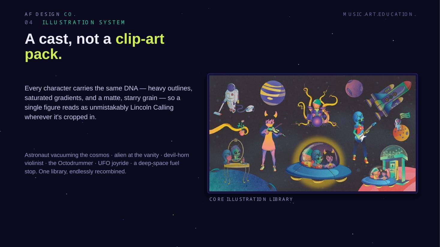
- One visual DNA (heavy outlines, saturated gradients, matte starry grain) so any crop reads as Lincoln Calling
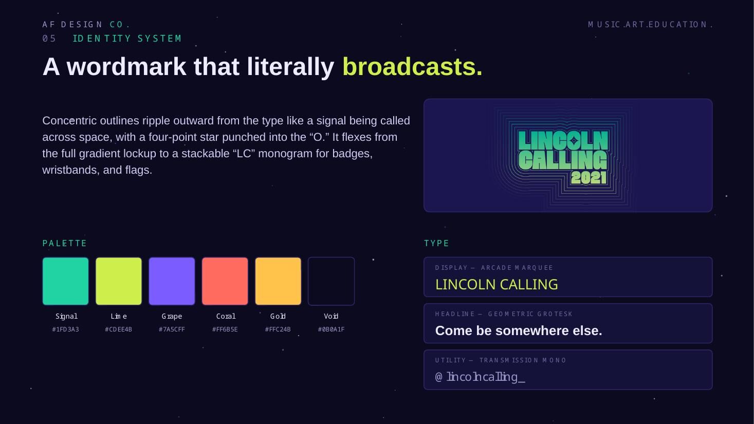
- Wordmark built to broadcast, with a stackable LC monogram for small-format applications
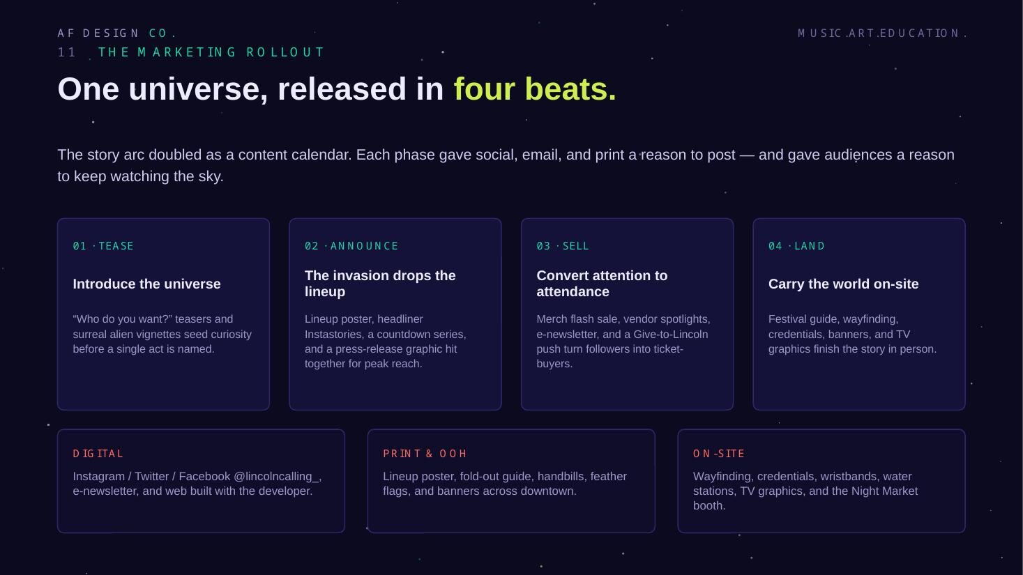
- Four-beat rollout — tease, announce, deepen, convert — doubling as the content calendar
- 03Execution
One universe, every channel
The same world powered the marketing across social, print and on-site — each channel getting the crop and cadence it needed rather than a resized copy — driving both brand and attendance.
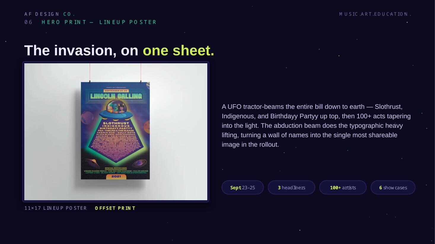
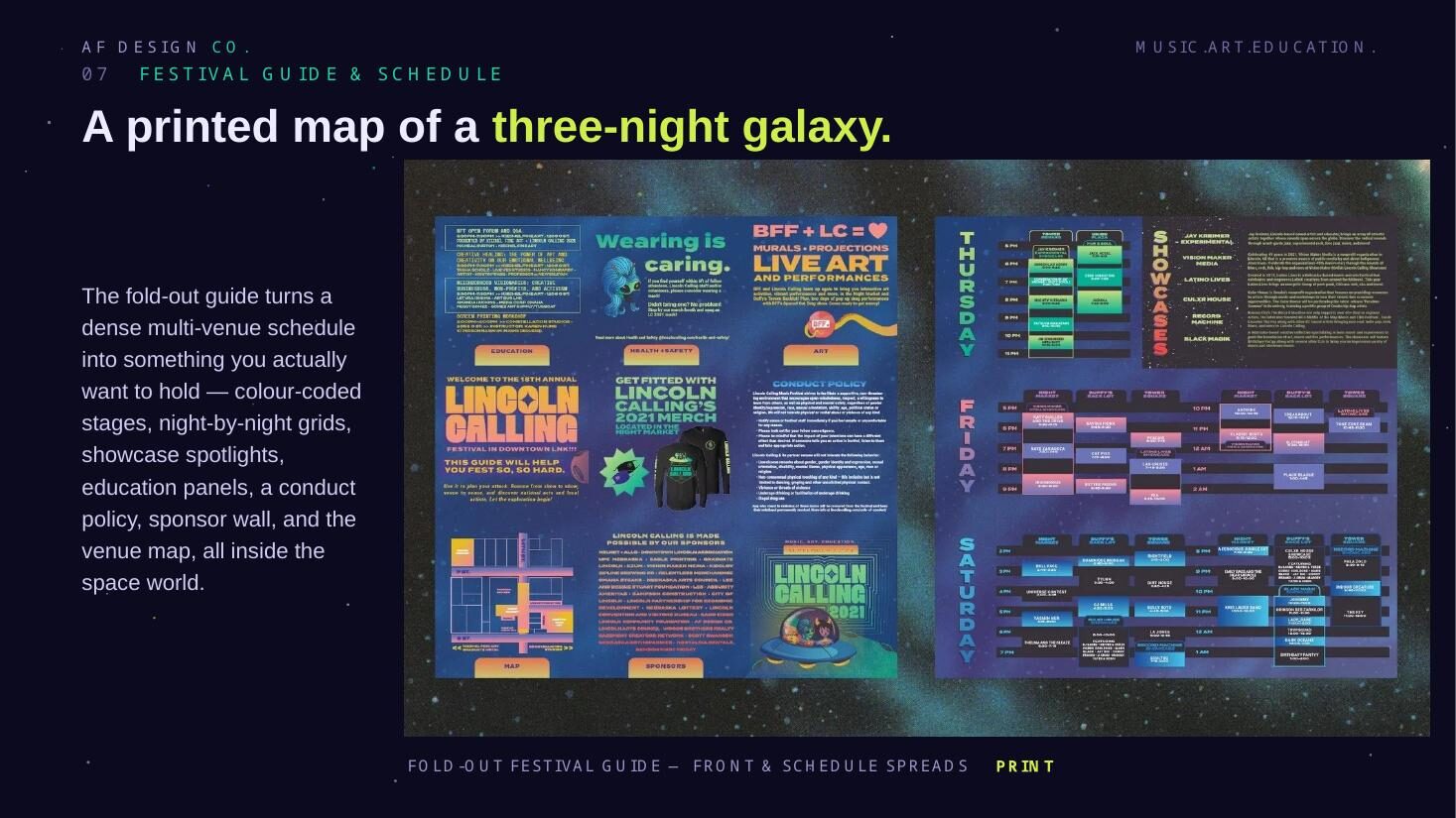
- Hero 11×17 offset lineup poster plus fold-out guide and schedule
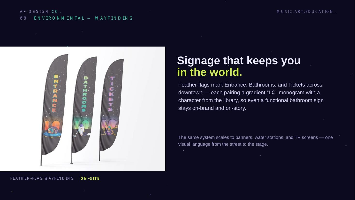
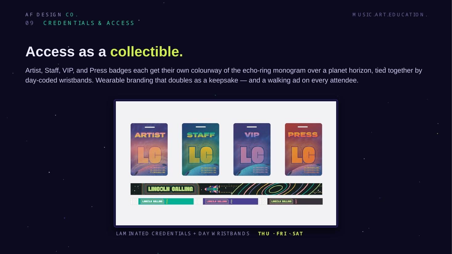
- Feather-flag wayfinding, credentials and day-coded wristbands for on-site
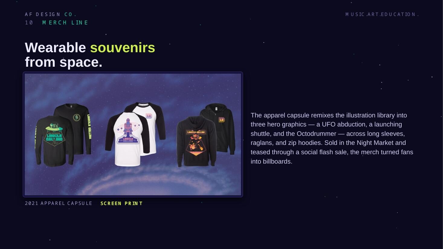
- Screen-printed apparel capsule pulled from the same character set
- Social and email sequenced to the four-beat arc through the on-sale window
Creative approach
Rather than another photo-led lineup flyer, the campaign built an entire surrealist space universe. Aliens and other-worldly beings pump gas, put on makeup and vacuum the stars — the ordinary made cosmic, with the strangeness itself acting as the invitation.
Every character shares the same DNA — heavy outlines, saturated gradients and a matte starry grain — so a single figure reads as unmistakably Lincoln Calling wherever it is cropped. One illustration library, endlessly recombined across print, social, wayfinding, credentials and merch.
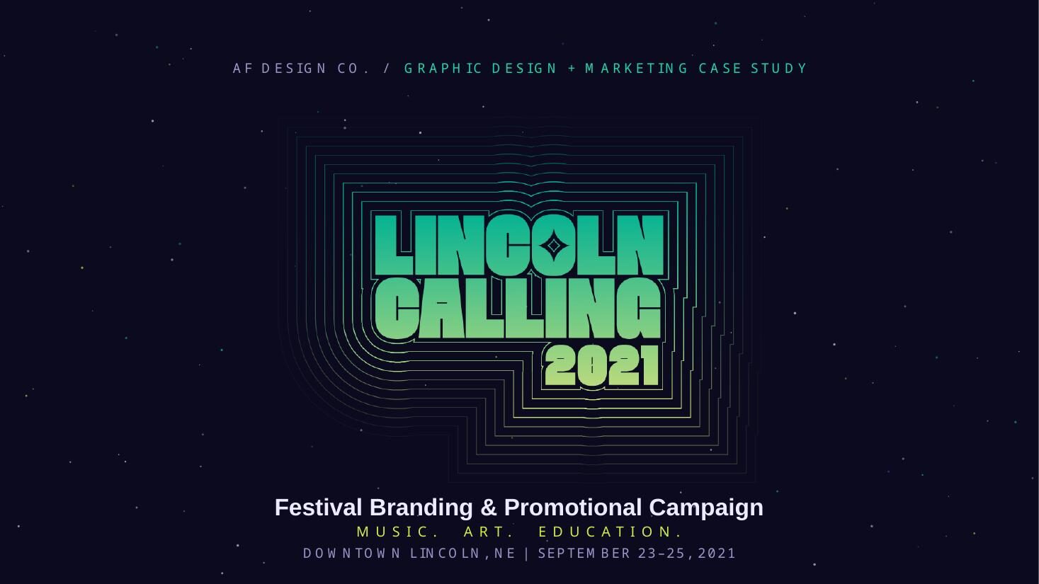
The wordmark ripples concentric outlines outward from the type like a signal broadcast across space, with a four-point star punched into the O, and flexes down to a stackable LC monogram for badges, wristbands and flags.
The rollout was structured in four beats — tease, announce, deepen, convert — so the story arc doubled as the content calendar for social, email and print.
The work
Walk the deck.
Use the arrows, thumbnails or arrow keys.
01 / 12The client — a nonprofit arts festival that runs on curiosity
Delivered
- Identity system and wordmark
- Illustration library
- 11×17 lineup poster
- Festival guide and schedule
- Environmental wayfinding
- Credentials and wristbands
- Apparel capsule
- Four-phase social and email rollout
Scope of ownership
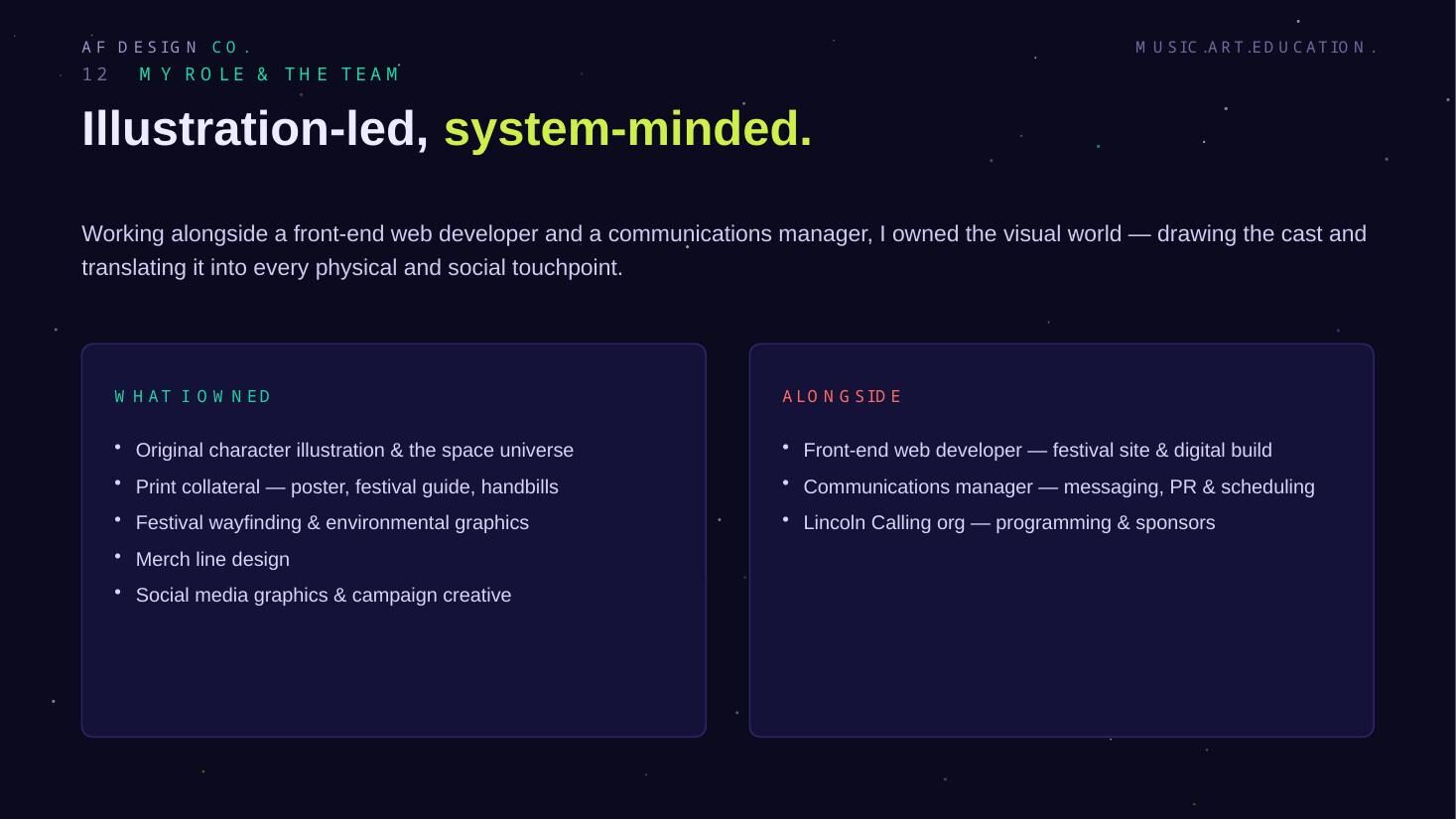
- Illustration and design lead across the full system
- Defined the campaign concept and the four-phase rollout structure
- Prepared print-ready files across offset, large-format and apparel
What this project demonstrates
One bold concept, built into a complete world — carried across brand, marketing and every attendance-driving touchpoint a festival has.
Performance results for this project are not published here. Metrics are available on request where the client has cleared them.
Next case study
TownHall Beef Tallow RolloutHave a brand, project or opportunity worth talking about?
Whether you're looking for creative support, stronger brand direction or want to discuss an opportunity, start a conversation with Audrey.