
Rebol Corporate Wellness Program
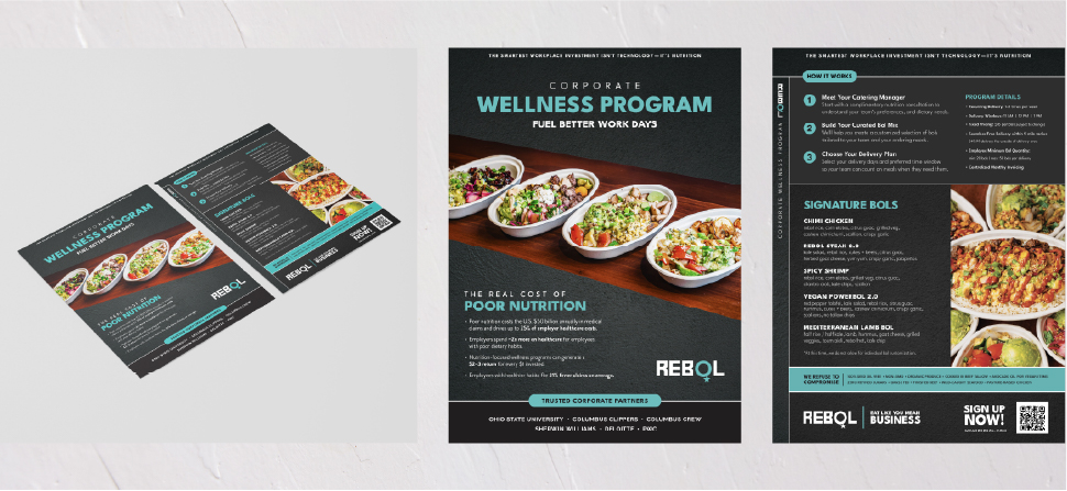
A print sales piece translating a B2B wellness program into a clear, scannable offer.
- Client
- Rebol
- Industry
- Hospitality and wellness
- Role
- Design
- Services
- Print design, Sales collateral, Information design
The problem
A B2B catering program with tiers, delivery windows, minimums and account terms was losing buyers in the detail. The offer needed to be readable in under a minute.
Background
A corporate catering program with recurring delivery, package tiers and account terms needed a leave-behind that a decision-maker could scan in under a minute.
Objectives
- 01
Make a multi-variable offer scannable for a business buyer
- 02
Let a decision-maker compare packages without a sales call
- 03
Give the sales conversation a credible leave-behind
Audience: Office managers and operations decision-makers buying recurring corporate catering.
Process
Planning, strategy, execution.
- 01Planning
Understanding the buying decision
Planning started with what a buyer needs to know to say yes, and in what order — not with what the program contains.
- Listed every program mechanic: cadence, windows, pricing, minimums, account support
- Sequenced them against the buyer's actual questions
- Set the format as a one-minute scan, front and back
- 02Strategy
Comparison as the layout logic
The strategy gave the tiers equal typographic weight so the reader compares rather than reads, with photography doing the appetite work.
- Program mechanics compressed into one tight information block
- Package tiers set at equal weight for direct comparison
- Photography carrying appeal so copy could stay factual
- 03Execution
A leave-behind that does sales work
Execution delivered a print piece usable in-person, in delivery bags and as a follow-up attachment.
- Front: how the program works
- Back: package tiers and terms
- Print-ready and reusable across sales channels
Creative approach
Program mechanics — delivery cadence, windows, pricing, minimums and account support — are set as a single tight information block instead of paragraphs.
Package tiers are given equal typographic weight so a buyer can compare them directly, with photography carrying the appetite appeal.
Delivered
- Two-sided print sales piece
- Information design system for the offer
Scope of ownership
- Design and information architecture of the offer
- Translated program operations into buyer-facing structure
What this project demonstrates
Information design as a sales tool — clarity applied directly to a revenue conversation.
Performance results for this project are not published here. Metrics are available on request where the client has cleared them.
Next case study
TownHall Menu OverhaulHave a brand, project or opportunity worth talking about?
Whether you're looking for creative support, stronger brand direction or want to discuss an opportunity, start a conversation with Audrey.