Brand / Print
Grrrl Camp 2024 Festival Creative
Illustrated lineup poster, merch and environmental creative for a two-day music, camping and art festival.
- Client
- Falconwood Park + 1% Productions
- Industry
- Live music and events
- Role
- Illustration and design
- Services
- Illustration, Poster design, Merch design, Event creative
The problem
Grrrl Camp — a female-forward music and arts festival — needed creative with a clear point of view: sell tickets before the gates opened, then orient people across stages, camping and vendors once they were on site.
Background
A two-day festival of live music, camping, art, workshops and vendors at Falconwood Park in Bellevue, Nebraska needed print and merch creative that could sell tickets, build recognition and extend the brand on site.
Objectives
- 01
Define the festival's brand with creative that stands out in a crowded event feed
- 02
Drive attendance through promotional print and social
- 03
Orient attendees across stages, camping and vendors on site
Audience: Regional festival and live-music audiences, then on-site attendees.
Process
Planning, strategy, execution.
- 01Planning
Three jobs, defined separately
Planning split the brief into promotion, wayfinding and merch so each got its own success test — and so one illustration system could serve all three.
- Confirmed print specs, social crops and merch application sizes up front
- Inventoried every on-site zone the map had to cover
- Set one illustrated visual language to cover promotion, wayfinding and apparel
- 02Strategy
A heroine to broadcast the lineup
Creative direction centered on bold, retro-psychedelic illustration — a wild-haired heroine broadcasting the lineup — so the poster reads as art in a feed, as a lineup up close, and as a brand mark on a shirt.
- One hand-lettered, high-energy central figure carries recognition at thumbnail scale
- Bill typography subordinate to the image but fully legible in print and on merch
- Wayfinding, social crops and apparel drawn in the same hand so every touchpoint feels like the poster
- 03Execution
One world, every surface
Execution extended the illustrated world from the poster into social, print, environment and merch — one visual language spanning every place the festival shows up.
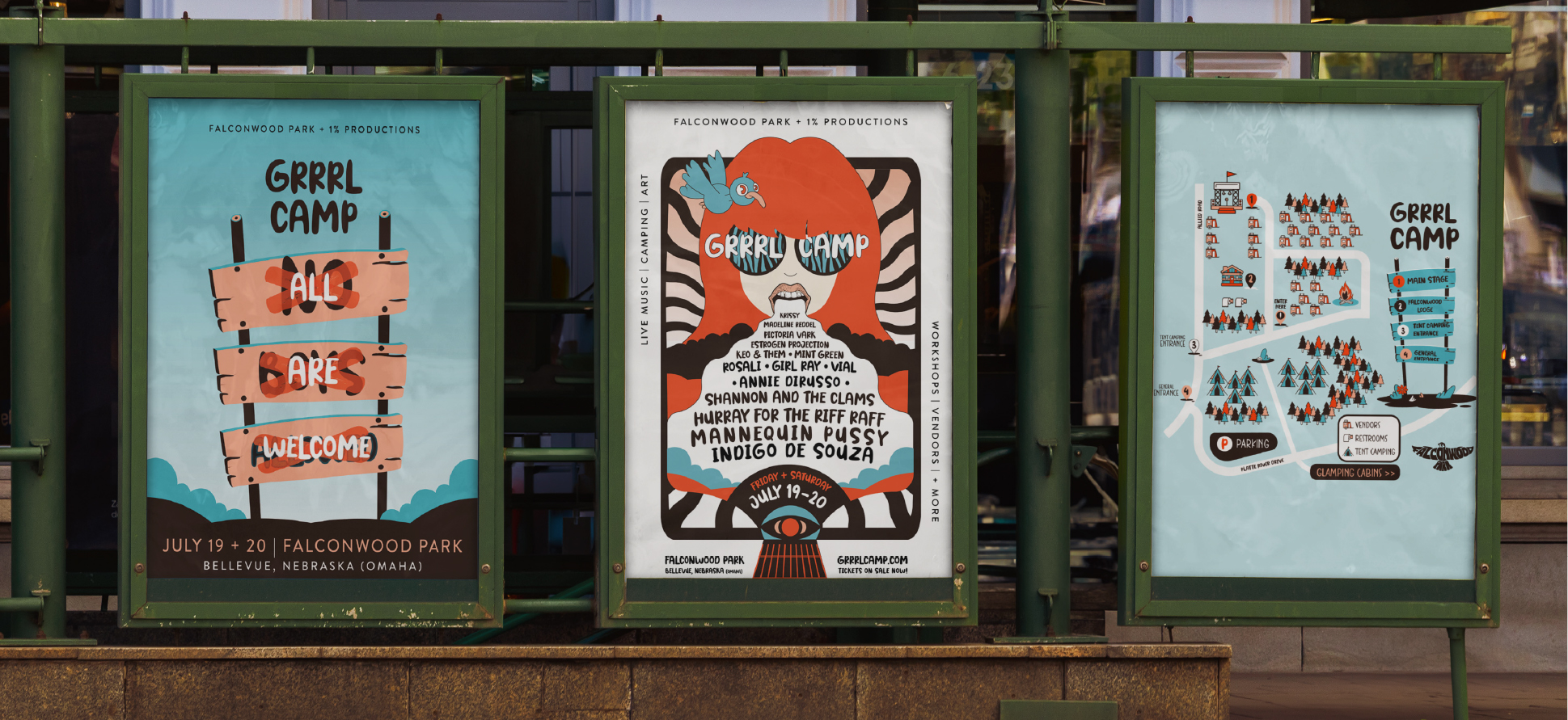
- 11×17 illustrated lineup poster with ticket QR
- Social graphics and organic content cropped natively for feeds and stories
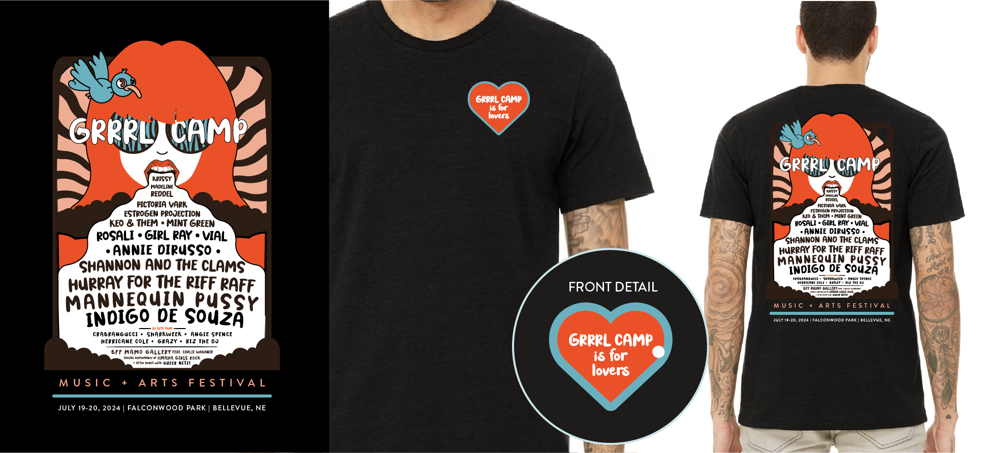
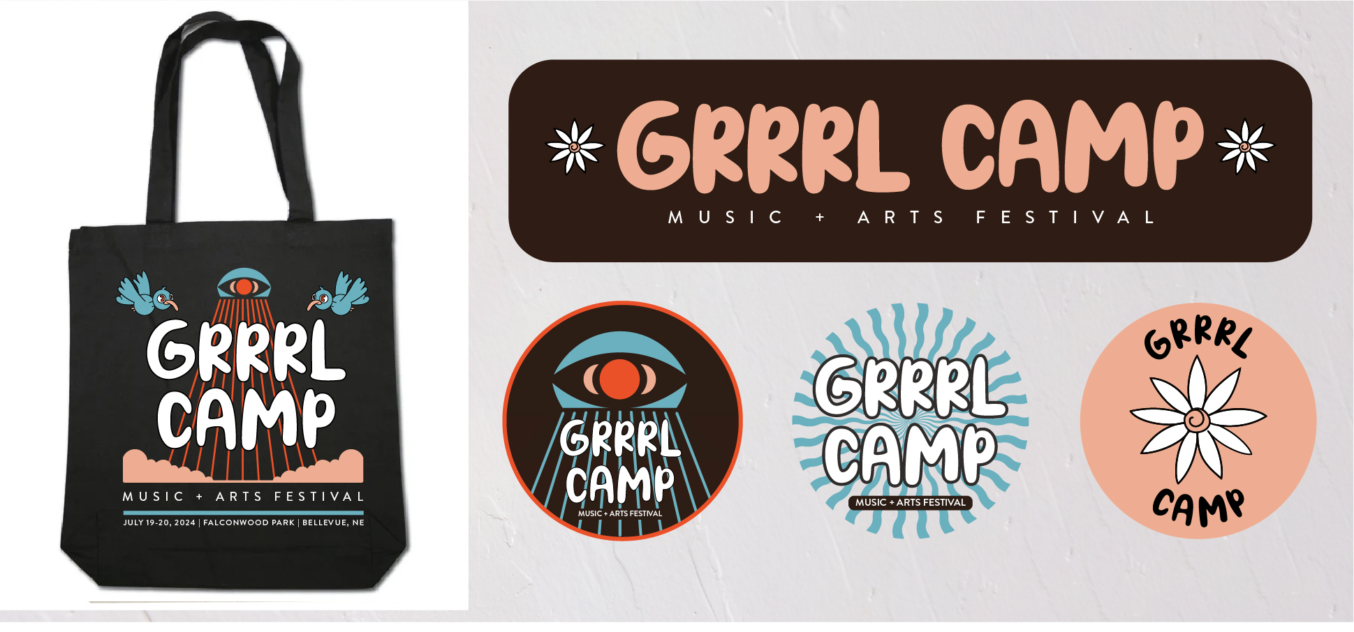
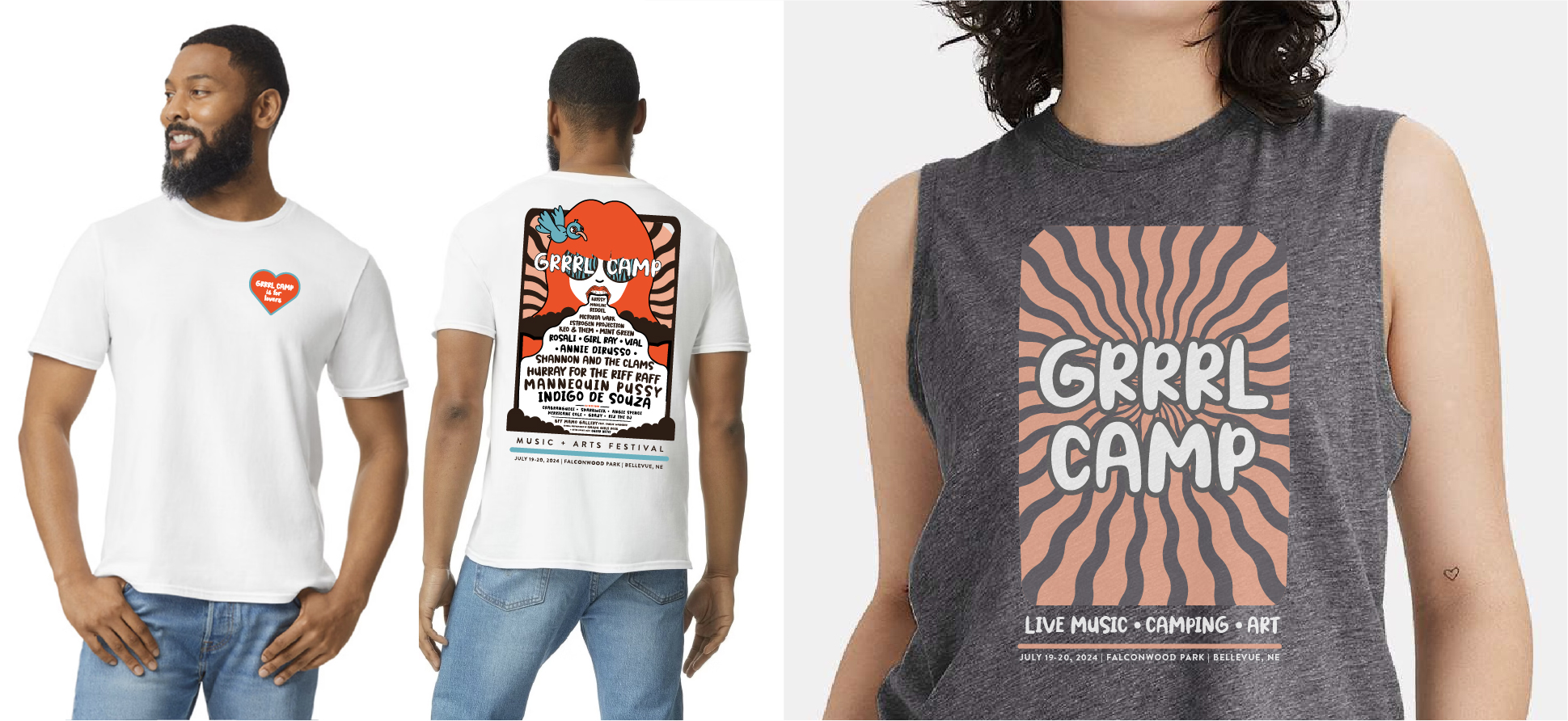
- T-shirts, tote bags and badges pulling from the same illustration library
- Hand-illustrated camp map covering stages, camping, entrances, parking, vendors and restrooms
- On-site signage carrying the same hand-drawn language
Creative approach
The lineup poster leads with a single bold illustrated figure so the bill reads as artwork first and a schedule second — built to work at 11×17, as environmental advertising and as a shareable social crop.
The same illustration system scales across t-shirts, tote bags and badges so the festival identity travels with attendees before, during and after the event.
The work
Walk the deck.
Use the arrows, thumbnails or arrow keys.
01 / 04Environmental poster display
Delivered
- Illustrated lineup poster
- Social media graphics
- T-shirt and apparel designs
- Tote bag and badge set
- Illustrated festival camp map
- On-site signage
- Print-ready promotional materials
Scope of ownership
- Creative direction and illustration for the full system
- Made the promotional and wayfinding creative share one language
What this project demonstrates
One hand-lettered, high-energy world spanning print and environment — built to define the brand and drive attendance.
Performance results for this project are not published here. Metrics are available on request where the client has cleared them.
Next case study
OSPRI Corporate Overview & Sales DeckHave a brand, project or opportunity worth talking about?
Whether you're looking for creative support, stronger brand direction or want to discuss an opportunity, start a conversation with Audrey.