
Brand
LYV The Wellness Space Brand Guidelines
Identity system and written guidelines for a wellness brand — logo, type and colour.
- Client
- LYV The Wellness Space
- Industry
- Wellness
- Role
- Brand identity and guidelines
- Services
- Brand identity, Logo design, Typography system, Brand guidelines
The problem
LYV's identity was being applied by different people across different materials. Without documentation, consistency depends on whoever happens to be producing the asset.
Background
A wellness brand needed a documented identity so the logo, type and colour would be applied consistently by anyone producing materials.
Objectives
- 01
Document the identity so anyone can apply it correctly
- 02
Cover the real range of placements without redrawing the mark
- 03
Keep future extensions inside the system
Audience: Internal teams, vendors and agencies producing LYV materials.
Process
Planning, strategy, execution.
- 01Planning
Auditing how the brand is actually used
Planning started from the applications the brand needed rather than from an ideal set of rules.
- Identified the placement range driving lockup requirements
- Determined what had to be specified versus left flexible
- Scoped the guidelines to what a producer would actually reference
- 02Strategy
Clarity as the brand attribute
Typeface and palette decisions were made against the brand's own position — clarity, innovation and human-centered optimization.
- Montserrat specified for scientific precision with approachability
- Full weight range documented so hierarchy is repeatable
- Palette organised into primary plus secondary and accent ranges
- 03Execution
Written down so it holds
Execution delivered lockups and rules in a reference format that survives handoff.
- Stacked and horizontal logo lockups
- Typography scale and weight specification
- Colour system with defined roles
Creative approach
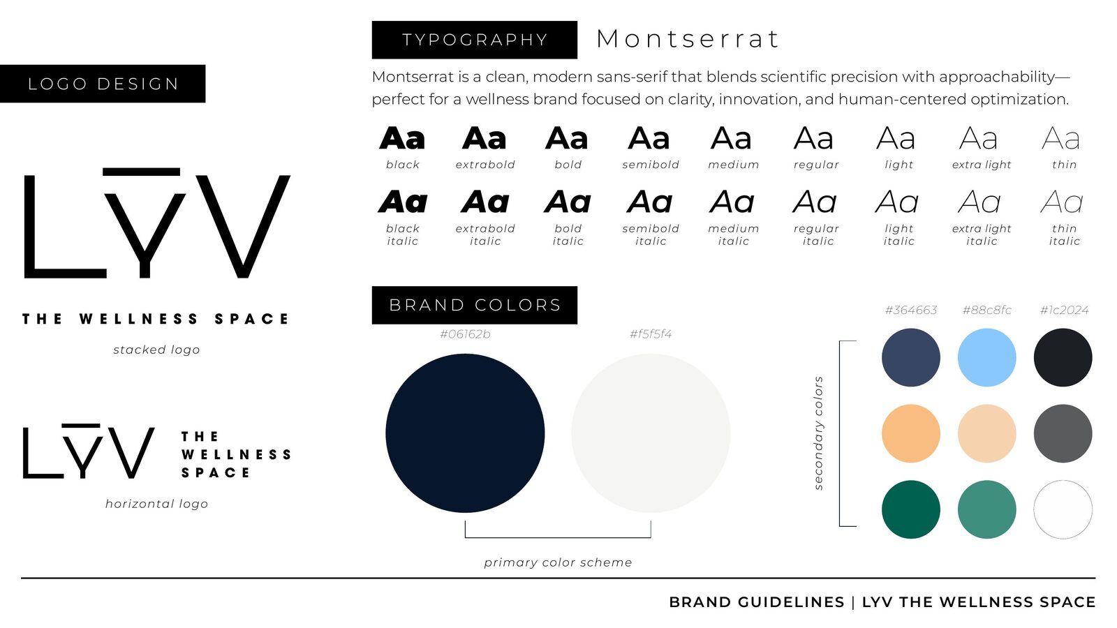
Stacked and horizontal logo lockups cover the range of placements the brand needs without redrawing the mark.
Montserrat is specified as the typeface — a clean, modern sans-serif that blends scientific precision with approachability for a brand focused on clarity, innovation and human-centered optimization — documented across the full weight range.
The palette is organised into primary colours plus secondary and accent ranges so extensions stay inside the system.
The work
Walk the deck.
Use the arrows, thumbnails or arrow keys.
01 / 01Brand guidelines — logo, type and colour
Delivered
- Logo lockup set
- Typography system
- Colour system
- Written guidelines
Scope of ownership
- Brand identity and guidelines authorship
- Defined the rules that govern future application
What this project demonstrates
Brand governance work — the difference between designing a logo and maintaining a brand.
Performance results for this project are not published here. Metrics are available on request where the client has cleared them.
Next case study
OSPRI Corporate Overview & Sales DeckHave a brand, project or opportunity worth talking about?
Whether you're looking for creative support, stronger brand direction or want to discuss an opportunity, start a conversation with Audrey.