Brand
Pixel Bakery Rebrand
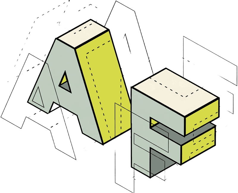
A full rebrand for a design studio — new isometric mark, illustration language and social identity system.
See the animated logo
- Client
- Pixel Bakery
- Industry
- Advertising and design studio
- Role
- Brand identity and design lead
- Year
- 2021
- Services
- Brand identity, Logo redesign, Illustration system, Social media branding, Brand guidelines
The problem
A design studio's own brand is its first proof of work. Pixel Bakery — a creative studio, not a food business — needed an identity refresh with enough personality to represent its playful, craft-driven culture and enough structure to hold up across social, digital and collateral.
Background
Pixel Bakery is a design and advertising studio, not a food business. The name is a metaphor for craft — mixing ideas, baking up campaigns — so the rebrand had to feel playful without being mistaken for an actual bakery.
A studio that sells creative thinking can't wear a dated identity. The rebrand needed a mark and visual language with enough personality to represent the studio's culture — and enough structure to flex across social, digital and branded collateral.
Objectives
- 01
Rebuild the logo as a distinctive, ownable mark
- 02
Create an illustration language unique to the studio
- 03
Extend the identity into a ready-to-use social system
Audience: The studio's clients and creative community — businesses buying design, and peers judging it.
Process
Planning, strategy, execution.
- 01Planning
Name as concept
Planning treated the name as a metaphor: baking stands for the studio's process of mixing ideas and refining campaigns. The creative foundation is craft, not cupcakes.
- Concept audit of the existing identity and its applications
- Baking imagery defined as a visual metaphor, not a literal category
- Social channels identified as the identity's highest-traffic surface
- 02Strategy
One system, one studio
The strategy unified the metaphor under a single illustration language — one line weight, one geometry — so a whisk and a camera read as parts of the same creative studio.
- Isometric block letterforms with play-button cutouts for the new mark
- Outline icon library mixing baking tools and studio equipment as craft symbols
- Coral and gold primary palette with a crisp blue secondary application
- 03Execution
Identity in the feed
Execution carried the system straight into the studio's social presence, where a design brand is most often seen and judged.
- Circular profile and highlight icons built from the illustration library
- Full-bleed icon patterns for branded backgrounds and collateral
- Logo, icon and pattern assets prepared for digital use
Creative approach
The new mark rebuilds the initials as isometric blocks — P and B as dimensional letterforms with play-button cutouts — giving the logo depth and a built-in sense of motion and media.
An outline illustration system treats the name as a visual metaphor: whisks, mixers and baking tins stand in for creative craft, set beside monitors, cameras and headphones. One line weight across every icon keeps the system cohesive whether it's rendered in coral and gold or single-color blue.
The icon library extends into a social identity system — circular profile and highlight icons for the studio's channels, each carrying a single isometric illustration on a brand-color field.
Color pairs warm coral and gold for the primary pattern work with a crisp blue for secondary applications, keeping the identity energetic without losing polish.
The work
Walk the deck.
Use the arrows, thumbnails or arrow keys.

01 / 01Social identity system and isometric illustration language
Delivered
- Redesigned logo
- Icon and illustration library
- Social media profile and highlight icons
- Brand pattern assets
Scope of ownership
- Brand concept, identity design and illustration
- Designed the full icon library and social identity system
What this project demonstrates
Rebranding a creative studio is identity design under a spotlight — the work itself is the portfolio piece.
Performance results for this project are not published here. Metrics are available on request where the client has cleared them.
Next case study
Wellness Flow PresentationHave a brand, project or opportunity worth talking about?
Whether you're looking for creative support, stronger brand direction or want to discuss an opportunity, start a conversation with Audrey.